Exlantix
Premium automotive brand, Chery Group
Chery Group’s new premium line needed a look that would read as premium in any market. We built its identity system, from the emblem to the imagery.
 A global design languageEmblem to imagery
4
parts of the system: emblem, typography, color, and imagery
Global
audience the design was drawn for
Exeed
the Chery Group portfolio Exlantix belongs to
The brief The ask
A premium line from Chery Group, made for buyers anywhere
Exlantix is a new premium line in the Exeed portfolio of Chery Automotive. It pairs advanced technology with luxury and was set up with a global audience in mind.
Our brief was the visual identity. Exlantix needed to step away from traditional Chinese design cues and speak a design language that would land in any market.
It also had to carry two things at once: how luxurious the product is, and how far the brand wants to go.
The brief, in short
- Global appeal
- Luxury
- A clean break from traditional Chinese design cues
Every element had to carry them, from the emblem down.
The system Identity
Emblem, type, color, and imagery, built as one kit
We designed every element together. Each one had to say the same things about Exlantix: quality, and the ambition to lead in luxury cars.
Emblem
The mark the rest of the system is built around.
Typography
The EXLANTIX wordmark sets the tone, with wide, slanted capitals that look like they’re moving.
Color
A color scheme picked to read as premium in every market the line enters.
Imagery
An image style that keeps every touchpoint looking like the same brand.
In use Touchpoints
The identity, out in the world
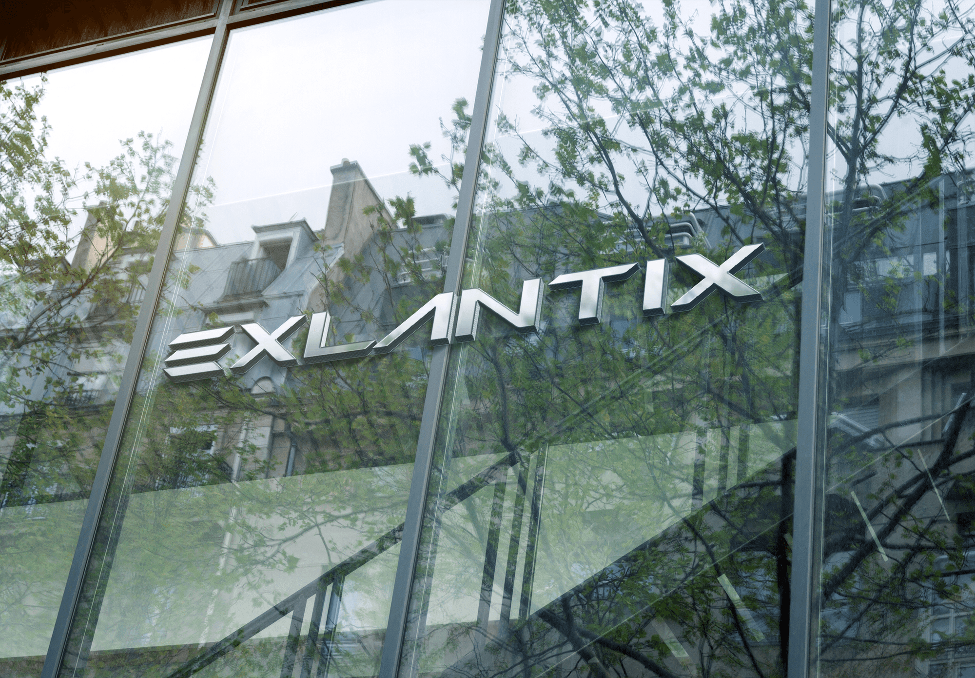
These environment mockups put the wordmark on architecture, from a street-level window to a tower facade.
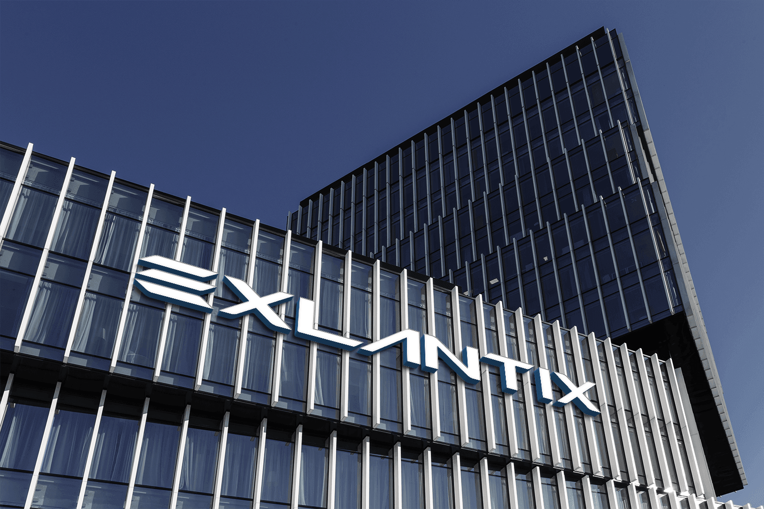
Brushed-metal letters on a glass storefront. The reflections run straight through the wordmark and it still reads.
White letters across a glass tower, sized for a building you see from a block away.
The result Ready to launch
One identity, ready for the international launch
The system now runs across every brand interaction as one experience. That gave Exlantix something solid to launch from outside China.
Global
Design language
Built to read in any market
4
Core elements
Emblem, typography, color, and imagery
Launch-ready
Base for the international launch
One experience across every touchpoint
What carries over
Name the audience before the logo
Exlantix aimed at buyers worldwide, so the design language had to work for all of them. Settle that before anyone sketches.
Design the whole kit together
Emblem, type, color, and imagery came out of one process, so nothing had to be bent later to match.
Picture it on a building
Environment mockups show early whether a mark survives glass, reflections, and distance.
Services delivered
- Brand Experience
- Design
- Packaging
- Visual Identity
About this case: Exlantix was a design project, so there are no campaign metrics to report. The images are environment mockups of the identity. This case doesn’t cover budgets or commercial terms.
Let’s talk
Building a brand for buyers outside China?
Share the product and the markets you have in mind. It goes straight to our design team, and they answer it.