ROC Skincare若珂
Skincare premium brand from France to China
A French dermo-skincare brand with a long record in anti-aging had to feel at home in China and keep its accent. We rebuilt it one layer at a time: story, name, identity, then packaging and guidelines.
 Chinese name: 若珂Retinol, vitamin C, hyaluronic acid
若珂
the Chinese name ROC launched under
4
brand layers rebuilt, in order
3
guideline sets: photography, video and web
The brand Starting point
A dermatologist’s brand that had to cross a cultural line
ROC makes skincare that’s tested by dermatologists and backed by science. Its products go after several skin concerns at once with active ingredients like retinol, vitamin C and hyaluronic acid. In anti-aging, it’s been a reference for a long time, and the range is cruelty-free.
The China brief was wide. It took in the brand story and experience, the visual identity, the logo and the name, plus guidelines for photography, video and web design.
The hard part was the balance. ROC had to feel French in China without feeling foreign, and local without drifting away from the global brand.
The test every decision had to pass
- Premium
- Effective
- Clinically credible
We asked the same question at each step: would a Chinese consumer read it that way?
The order How we built it
Story first, pixels last
Each layer leaned on the one before it, so we built them in sequence. A name chosen before the positioning was settled would have had nothing to stand on.
Positioning
Brand story
We kept ROC’s core: dermatology, proven actives, anti-aging know-how. Then we rewrote the story for a health-conscious Chinese shopper who reads labels.
Naming
A Chinese name
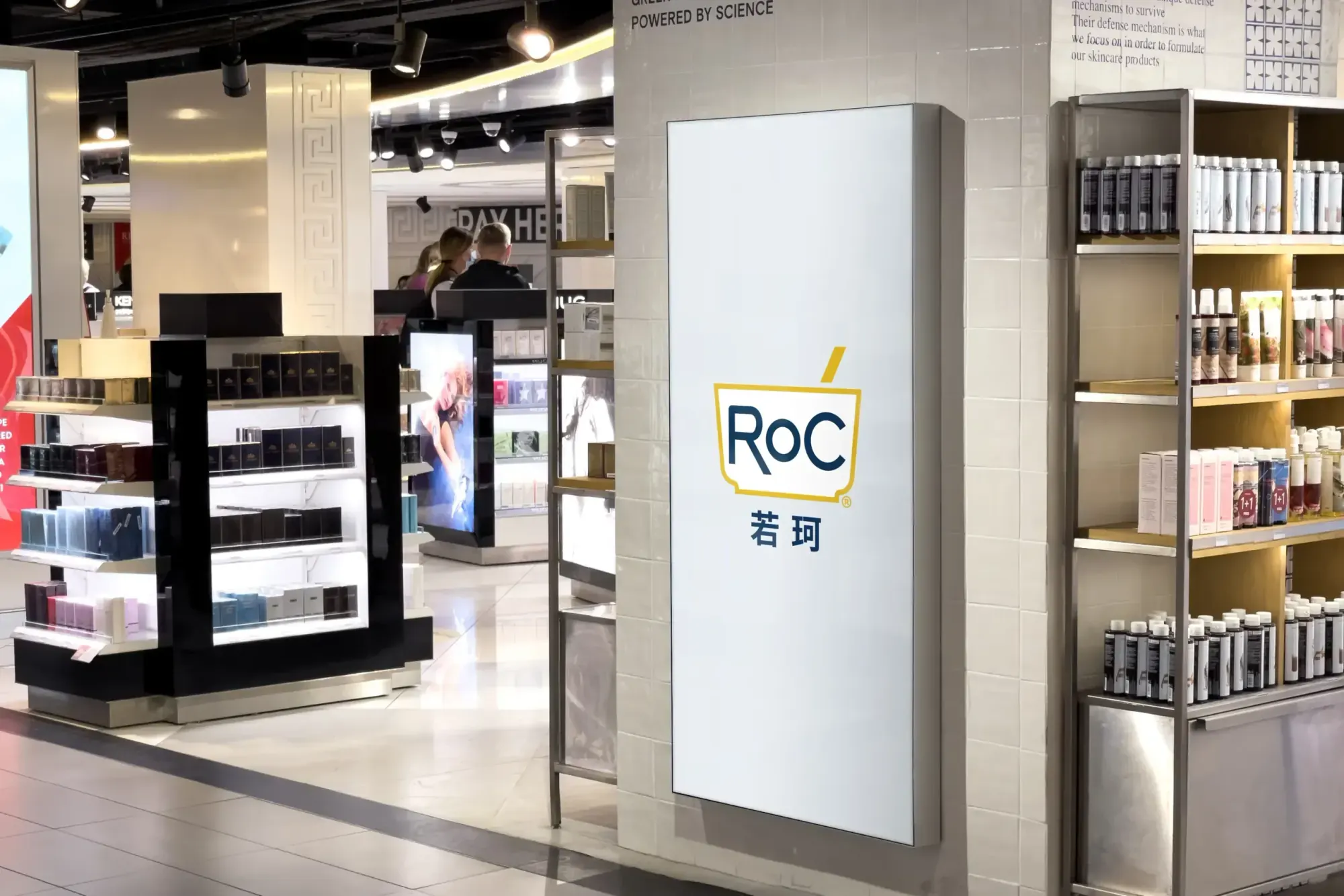
ROC became 若珂 (ruò kē) in China. The name sits under the Latin logo, so the global mark stays the hero.
Identity
Visual system
The logo, and the way it locks up with the Chinese name, worked out around the original mark so the global brand stays recognizable.
Application
Packaging and guidelines
Packaging rules plus guidelines for photography, video and web design, so every team producing ROC content in China works from the same page.
The identity Out in the world
One mark, from the jar to the bus stop
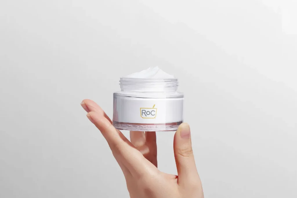
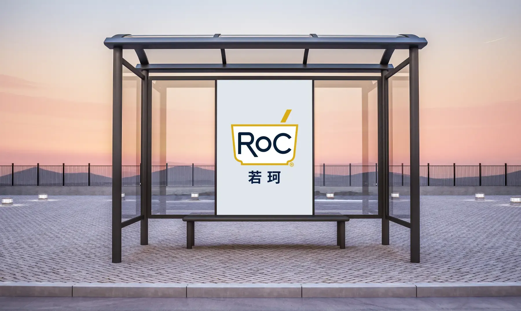
The test of a visual system is how it holds up away from the brand book. Here it is on a product shot and on an out-of-home concept adapted for tier-one Chinese cities.
The system on real surfaces
On the jar, the logo stays small and clean. The cream and the clinical white do most of the talking.
A bus shelter concept for tier-one cities. Latin mark on top, 若珂 underneath, plenty of white space around both.
What the guidelines cover
Photography
One set of rules for shooting ROC in China, so a local shoot still looks like ROC.
Video
Guidelines for ROC video made in China and for Chinese viewers.
Web design
Design guidelines for ROC’s Chinese web presence.
Packaging
How the mark and the Chinese name sit on pack, kept consistent with ROC’s global standards.
Today Takeaways
The French character stayed, and the brand now speaks Chinese
ROC now has a full China presence: a story, a name and an identity that run across every touchpoint and still match the global brand.
What carries over
Build in order
Positioning before naming, naming before design. Skipping ahead means redoing work later.
Keep the origin visible
ROC had to read as French without reading as foreign. So the Chinese name sits under the global mark and never stands in for it.
Credibility is the brief
In clinical skincare, every visual choice gets judged on one thing: does it look like it works?
Services delivered
- Brand Experience
- Design
- Packaging
- Visual Identity
About this case: the scope, sequence and deliverables come from our project records. The images show the identity in use, including an out-of-home concept made for tier-one cities. This case doesn’t cover budgets or commercial terms.
Let’s talk
Taking a beauty brand into China?
Tell us where the brand comes from and what it can’t lose on the way. A real person reads every message and writes back.